Kiln & Co.
(Identity · 2024)Identity and labels for a small-batch ceramics studio.
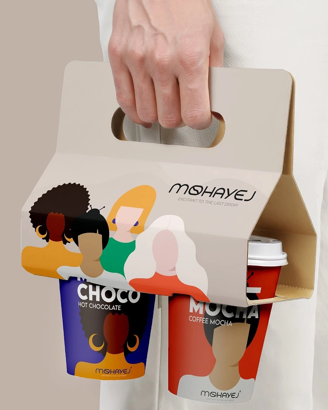
01 — The brief
Where they were
Kiln & Co. had outgrown the brand they started with. It looked like everyone else in ceramics, and it wasn’t telling people what made them different.
We began with interviews, a visual audit and a workshop with the founders to find the one idea worth building everything around.
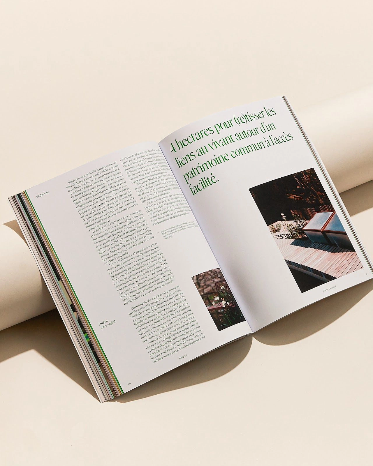
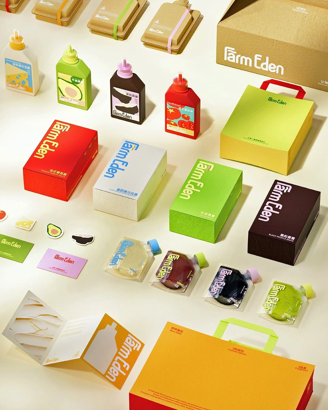
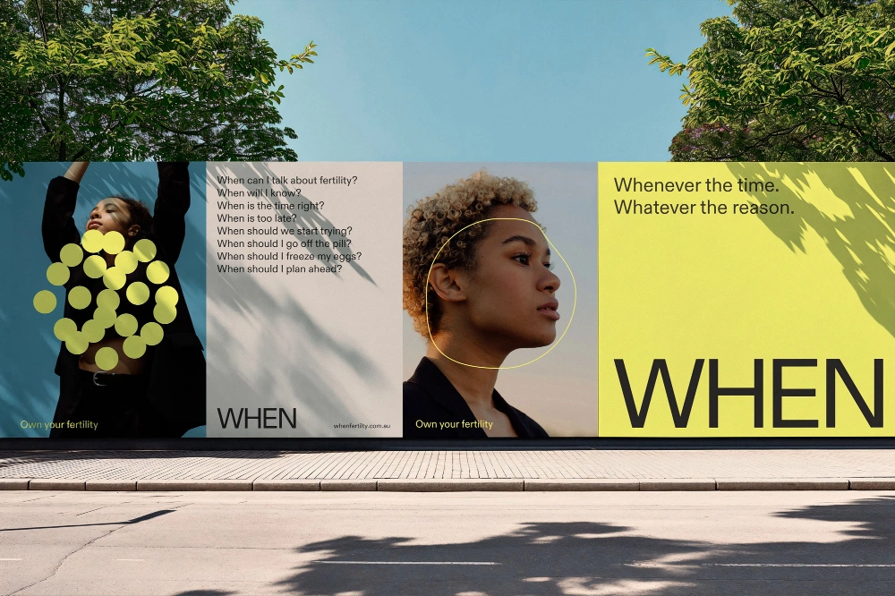
02 — The edit
What we cut, what we kept
We explored widely, then edited hard: three routes became one. The result is a system built on a single idea, with type, colour and imagery that all say the same thing.
Every touchpoint, from guidelines to social, was designed to work as one family.
3x
More enquiries in the first quarter
68%
Uplift in social engagement
12
Weeks from brief to launch
They didn’t add more. They took away everything that wasn’t us, and suddenly the brand made sense.Founder, Kiln & Co.
Lumen